
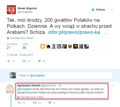
Idiotyczny „żarcik” amerykańskiego nastolatka posiadającego polskie nazwisko, wywołał małą burzę na temat obozów koncentracyjnych i (jak twierdzi większość komentujących) bezsprzecznego, czynnego i masowego udziału Polski i Polaków w zagładzie Żydów. https://www.reddit.com/r/beholdthemasterrace/comments/8pankf/senior_quote_from_my_alma_mater_that_somehow_got #polityka #obozykoncentracyjne #niemcy #zydzi #historia
Zidentyfikowano pojedynczą komórkę, która może odbudować cały organizm
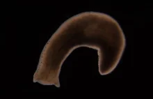
"Płazińce, małe robaki zamieszkujące rzeki i jeziora, mają zdumiewającą zdolność. Są w stanie regenerować się właściwie bez żadnych ograniczeń. Ostatnio naukowcom udało się zidentyfikować typ komórek, dzięki którym zawdzięczają tę niesamowitą umiejętność."
z- 44
- #
- #
- #
- #


